Studies involve capturing data. Statistical techniques allow data to be used to answer important research questions. A case series may have data on a handful of subjects but we are now entering the Big Data arena where datasets can be enormous.
Step one in ‘getting your head around’ the data is to explore it. You might create tables (reporting frequencies for categorical data) or create plots (typically a histogram or box plot for continuous data) or use summary statistics – typically one for the ‘average’ measure (statisticians call this central location) and one to describe how variable the data are (statisticians may call this dispersion) – do patients tend to have very similar answers to each other or do they differ greatly? If you are interested in seeing how variables relate to each other you might use cross tabulation for categorical variables or a scatter plot for continuous data.
The three Ms
Common measures of central location seen in ophthalmic research are the mean, the median and, perhaps less commonly, the mode.
The mean is simply computed by adding up all your data and dividing by the number of observations.
The median is calculated by ranking (sorting) your data from the smallest to the largest (or the other way around) and picking the term in the middle. If there are two values in the middle you simply take the mean of these, i.e. (A+B)/2.
To decide whether to use the mean or median, draw a histogram.
You can use Excel or R to produce your histogram and if you get stuck, Google “how to do a histogram in R” and you will instantly find YouTube videos showing you exactly what to do.
If the histogram looks approximately bell shaped, you are OK to use the mean. A typical bell-shaped histogram shows that data are normally distributed.
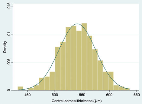
Figure 1: A typical bell-shaped histogram.
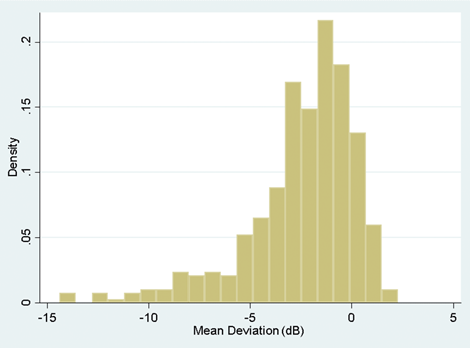
Figure 2: A histogram illustrating skew to the left.
If the histogram is skewed to the right or left (i.e. a few very large or very small values), the mean will be pulled towards these outlying values and because of this the median would be a more reliable measure to use for central location. An example of this might be the case where you are looking at the duration of symptoms in patients prior to clinic visit. If a condition is very unpleasant you might find that most patients come to the clinic within days of the onset. Some people may, however, be unusually stoic and perhaps you will even find an individual who has a real fear of clinic attendance and actually delays seeking help for many months. If you work out the mean in such an instance, it will not adequately reflect the average value because it is drawn towards the outlier. It is therefore larger than most of the data that you have observed. In such a situation you are better to use the median.
The mode is simply the most commonly observed value – for example, if you asked glaucoma patients how many eye drops they take daily, answers might range between zero and four (or more), but the most common value might be just one drop per day in which case the mode would be one. Occasionally you have multimodal data – i.e. there is more than one common value.
Once you have provided your central location you need to describe how variable your data are. A very simple way to do this is to provide the range which is simply the smallest value to the largest value. The problem with this is that if you have a very extreme value as was the case with the stoic who did not seek help and thus had a very long duration of symptoms prior to clinic visit, the range would be very wide indeed but apart from the one stoic, people may have had values that were fairly close to each other.
A better measure of variability here is called the standard deviation (SD). You could work this out by hand but in reality you will have access to computers that can do this for you. The standard deviation is used because continuous data often follow a normal distribution and if your data follow such a distribution (i.e. data form a typical bell-shaped histogram) then from statistical theory 95% of your data will lie between the [mean – 1.96*SD] and the [mean + 1.96*SD]. A value which sounds similar to the SD is the standard error. They are not the same and you need to understand that the standard error is not used for summarising data.
If your data are not normally distributed (your histogram doesn’t look roughly symmetric or bell shaped), then you wouldn’t use the SD. Instead you would quote the interquartile range (IQR). This is a range that goes from the 25th percentile (or first quartile) to the 75th percentile (the third quartile). If you rank your data from smallest to largest, the smallest value would be the first percentile, the largest would be the 100th percentile. In general, if you have used the median (also known as the 50th percentile or second quartile) then you would expect to see the IQR rather than a SD.
Exploring the data allows you to attach clinical meaning to the data. This is where you may have an advantage over a statistician who has little experience of analysing research in your area of expertise.
If you draw a histogram and observe a very large value – you, unlike the statistician, may know whether it is biologically plausible to observe such a value or whether it is more likely an error made within the laboratory.
Another way to identify whether your data are normally distributed or not is to compute the SD and the mean. If the data can only take positive values – duration of symptoms, intraocular pressure, central retinal thickness – none of these can be negative as would be inferred by an interval that spans mean – 1.96 SD to the mean + 1.96 SD, so if the mean is less than SD/2, you can infer that the data are skewed and it is not OK to use the mean and SD.
You can use the median and interquartile range to summarise ordinal data by assigning a value of one to the smallest category, two to the next smallest and so on to the largest category. You can then rank your data and determine the category of the middle observation.
If you have dichotomous data (i.e. only two categories) or nominal data (i.e. more than two unordered categories), you would probably simply report the number and percentage of each category.
A picture can say a thousand words
We have already mentioned the histogram as a very useful tool in determining whether or not continuous data are normally distributed. Another useful plot is called the box and whisker plot (Figure 3).
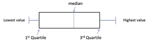
Figure 3: Illustration of a Box and Whisker plot. (Note that sometimes this shows the whiskers going from the lowest value to the highest but other times it may go from the second percentile to the 98th percentile or indeed other defined points, with observations beyond the whiskers depicted as dots, circles or stars). Occasionally the median (also called the second quartile) will be the same as the lower / first or upper / third quartile so that the box will appear to be missing the central line. For categorical data, pie charts and bar charts are used, both easy to produce using Excel.
Summarising data – why bother?
A spreadsheet of data can be very tedious for even a statistician to digest. Summarising your data can bring this data to life and make it interesting even to those who would describe themselves as averse to statistics. The ABC trial which was conducted prior to ranibizumab being available to NHS patients with age-related macular degeneration (AMD) and compared bevacizumab against standard care showed a mean increase in visual acuity from baseline to one year of seven letters on an Early Treatment Diabetic Retinopathy Study (ETDRS) chart in the bevacizumab group versus a decrease of nine letters in those patients receiving standard care [1]. This was a huge difference and emphasised the step change in the management of AMD that happened with the introduction of anti-VEGF agents. United Kingdom glaucoma treatment study (UKGTS) showed that 35 out of 231 patients with primary open angle glaucoma treated with latanoprost experienced visual field progression at 24 months, in contrast to 59 out of 230 similar patients treated with placebo. Expressing these as 15.2% versus 25.6% conveys more rapidly the message of a better outcome with latanoprost [2].
Summarising data can bring it to life so that you can see beyond data and engage your clinical expertise in interpreting findings. To truly gain insight from data and translate to clinical understanding requires this interface between statistician and those without formal statistical training. Better translation will help move medicine forwards.
Previous learning
-
Statistical methods attempt to convert data into meaningful information that might answer a research question that you have.
-
There are different ways of classifying data but one method is to consider whether the data are quantitative or categorical.
Current learning
-
Summarising your data allows you to rapidly convey information to others.
-
Summarising your data can bring the data to life.
-
Your clinical expertise can translate the summary statistics into things that have meaning to patients. You may be able to show that one treatment tends to work better than another or identify risk factors for disease or outcome.
References
1. Tufail A, Patel PJ, Egan C, et al; ABC Trial Investigators. Bevacizumab for neovascular age related macular degeneration (ABC Trial): multicentre randomised double masked study. BMJ 2010;340:c2459.
2. Garway-Heath DF, Crabb DP, Bunce C, Lascaratos G, Amalfitano F, Anand N, Azuara-Blanco A, Bourne RR, Broadway DC, et al. Latanoprost for open-angle glaucoma (UKGTS): a randomised, multicentre, placebo-controlled trial. Lancet 2015;385(9975):1295-304.
Useful resources
- Presenting Medical Statistics’ book website:
http://medical-statistics.info - NIHR Statistics Group:
https://statistics-group.nihr.ac.uk/research/new-sections - Centre for Applied Statistics Courses:
www.ucl.ac.uk/ich/short-courses-events/about-stats-courses - Bunce C, Patel KV, Xing W, et al; Ophthalmic Statistics Group. Ophthalmic statistics note 1: unit of analysis. Br J Ophthalmol 2014;98(3):408-12. (Open access).
- Bunce C, Young-Zvandasara. SOS (Simplified Ophthalmic Statistics). Part 1: An introduction to data – how do we classify it and why does it matter? Eye News 24(6):36-7.
Part 1 of this topic is available here.
Part 3 of this topic is available here.
Part 4 of this topic is available here.
COMMENTS ARE WELCOME